Monday, September 27, 2010

Senior Project Pt. 2

Here is the 2nd (and hopefully less complicated) portion of my previous post; the application of what we learned.

I've gotten a camera lens from a company, Loreo, call lens in a cap that takes photos from 2 separate perspectives at the same time. Basically, it looks like this:


And here is a photo that I took using it at a wedding of my friend, Lee:


Note that the left image looks very similar to, but is slightly different than the right image.

How to make the image above look 3d

I would explain it, but photographer Neil Creek is much better at it so I'll send you his way:
http://www.neilcreek.com/blog/2008/02/28/how-to-see-3d-photos/

Here's another photo of his to try it on: A light painting that I will definitely be trying out, soon.


Copyright All rights reserved by neilcreek

This post is important! I will be showing images like this for a while, I'm sure! So for them to make sense you should learn how to cross-view!
For those who can't, though, there are viewing tools such as Loreo's pixi-viewer that is like a pair of glasses that does the crossing over for you. I emailed the company that sales them and asked for a donation of 10 pair for guests to use at my senior exhibition which they replied to and agreed to send me. So major props to Loreo for cool equipment and staff!

This is all for now.

Senior Project Pt. 1

For those who don't know, I've entered into my senior year (sort of) here at GCSU. I will be graduating in December of 2011. I will get a BA in Studio Art. For our senior capstone, we're required to take 2 classes consecutively, senior project and senior exhibition. Senior project is a prerequisite to senior exhibition and is what I am taking this semester.
Basically, I have to put together enough work on my own between this and next semester to have an exhibition of all of my own original work.

I have decided to work with 3-dimensional images and video to demonstrate and emphasize/exaggerate art as an experience.
So, bring on the technicalities: How does 3D imaging work? - How do we add depth to a flat or 2 dimensional surface?

Let's start from the beginning. How is it that we see in real life? and, what I'm interested in, how is it that we see depth? Fortunately, we've had some wise guys in the past do the work for us. We just have to read their words and look at their diagrams. "It is by the combination of two plane pictures of an object, as seen by each eye, that we see the object in relief, yet the relief is not obtained from the mere combination or superposition of the two dissimilar pictures. The superposition is effected by turning each eye upon the object, but the relief is given by the play of the optic axes in uniting, in rapid succession, similar points of the two pictures, and placing them, for the moment, at the distance from the observer of the point to which the axes converge." -David Brewster

Simple enough? :) Let's break that down. And for this post I am going to focus on the first sentence. We have 2 eyes. Each eye lets in light and "sees". The brain processes the image from the left eye as well as the image from the right eye and puts them together. This is where depth is obtained- since there is space between your eyes, each one has a different perspective. How do we know this? Common sense. Close your left eye, then close your right and eye and you will see 2 very similar but slightly altered images. Altered because they are observing from 2 separate angles (see diagram below).

Let's reference the sentence in bold to better explain how we see, though. "It is by the combination of two plane pictures of an object, as seen by each eye, that we see an object in relief". Relief here means an object's depth, distance from ourselves.

Okay, pulling it back together. We see by the combination(or superposition) of our right and left eye.
How do we use this concept to create 3D images or video? By the art of illusion.

 Replace the words "left eye" and "right eye" with "left camera" and "right camera" in this diagram. That's right- we take pictures/film with 2 cameras at the same time and spread them about the same distance apart as human eyes. Then, through various processes, allow the left eye to only see what the left camera filmed and allow the right eye to see only what the right camera filmed. It is mimicking how our vision works. Whenever we see both images put together, our brain processes the depth just as it does things in every day life.

Thursday, September 23, 2010

Let's show September some love, shall we?

September. It has blown by. Some of my favorites this month:
 
This is a picture that I took at the Atlanta Motor Speedway. An interesting technique that I have found is to convert a photo to black & white and overexpose it. In this case, I believe that it captures my environment perfectly. Nascar races are raw. And so are their fans. I can almost feel the grit in the photo.


I figured I might as well show this one as well. The same technique was applied. B&W, overexpose. the darks need to be dark. We want a full range of values still. Dark darks and white whites. Basics! Lest we not forget them! --also taken at the race


I have mixed opinions here.The texture of the fence and cement wall are wonderful, with a sort of distorted color to make it intersting.
The car. Does blur work here? yea...no...maybe? It shows speed and direction following the lines of the track, yes, but I almost wish it were More blurred. either that or really clear, like pictures of water droplets frozen in time it would interest the viewer, I think. I got in trouble for standing in this spot to take a picture so I couldn't test my theories. Hm.. perhaps next time.


John Schnatter (Papa John) decided to make a surprise appearance to some lucky fans, and one lucky photographer. Actually, the reason I was at the track was because I got the opportunity to work at a mobile kitchen in winner's circle of the track because Papa John's was sponsoring the race for the day. I made he and his family their pizzas. Claim to fame!
I love the emotion in this picture- I'm not sure, but it seems that Papa John really is enjoying himself for a few moments. He's still proud of his product and apparently gives it away by the hand fulls.


Yep. Here we are, inside the mobile kitchen. In this bag, for those who are curious, is what we call "dustinator", a cleverly named formula of flower and corn meal that is used to coat and handle the dough.


"Ya see that? Yep, son. It's yet another fast and obnoxiously loud car. Isn't it wonderful?"


Alright, I've tons more, but enough of that event. Here's a few more that I snapped on a separate night. This was on a walk around campus.


I was walking with the GCSU Wesley praise band because I was doing some band pics for them- I decided to do portraits of each band member. Here are 2:


The challenge. I took these pictures at night.. when it's dark.. with a stock flash that comes with the camera. The challenge was editing them to undo the damage a bad flash can do. Some things, the wrong things, were over exposed while others needed more light and focusing is an issue because the camera can't see much to focus on (because all it sees is black) among other difficulties. But anyway, lesson learned. Night portraiture, not easy.


My roommate is trying to sell his R6 crotch rocket. As I'm finding a pattern, he asked me to take pictures of his newly acclaimed vehicle so that he could prove a motorcycle has existed in his past. Note the poor editing in the bottom left corner of the frame/border- I assumed anyone looking hard enough at a picture on craigslist to notice and care about such a flaw Probably is not the type of person interested in buying a crotch rocket, so I just didn't really bother with it.


I like to think I took full advantage of this fine piece of machinery which still sits in my yard.

Yes, those pants are from the 70's.


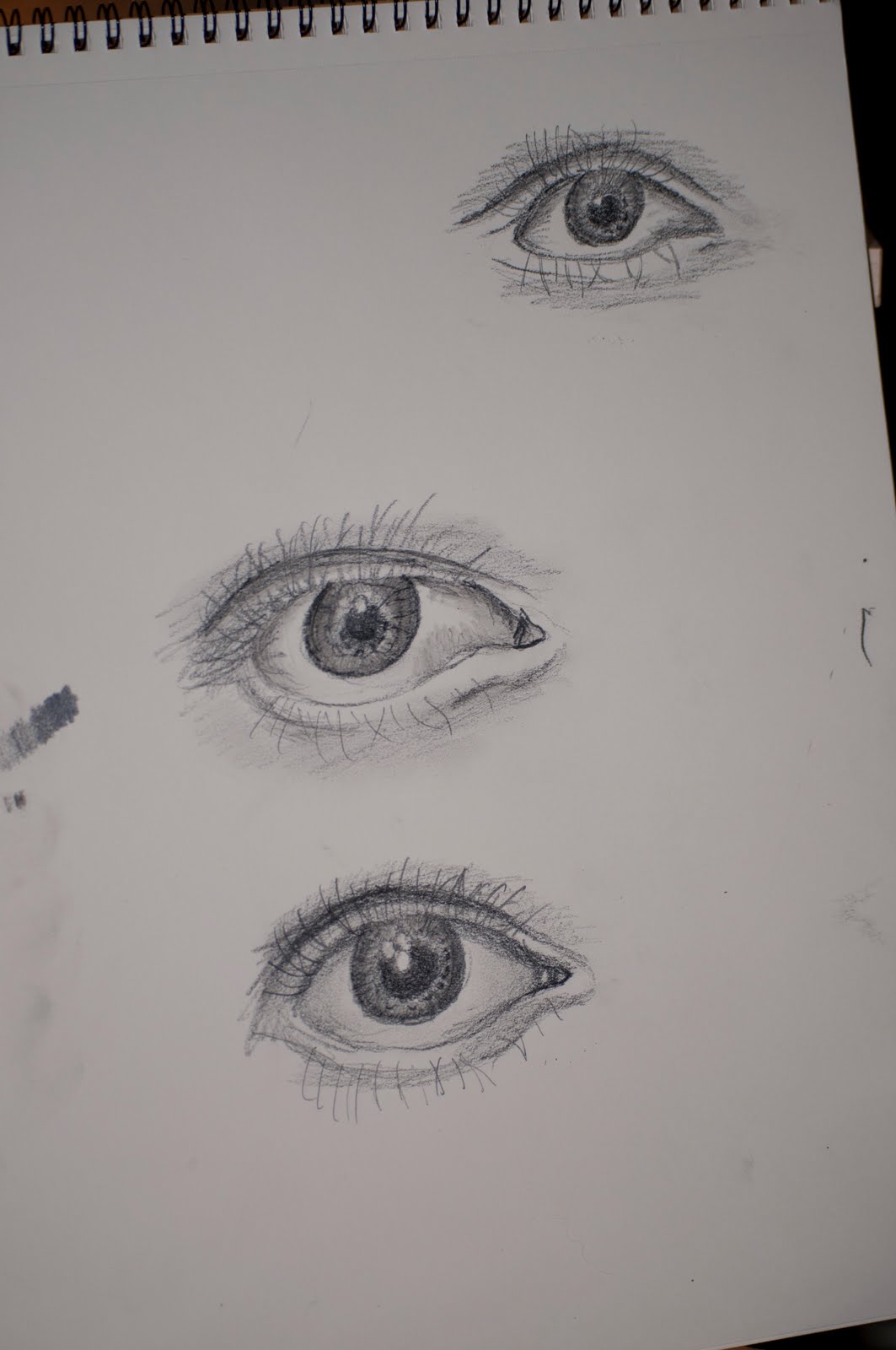
Later I will post some drawings and sketches that I've done in various art classes and notebooks, but for now, hopefully this will satisfy. More to come.

Hmm. =]

Wednesday, August 25, 2010

Figure Studies

I did my first ever drawing from a model today (no, mom. She wasn't nude). Here's the finished product:


Overall I'm pleased. I've never done this, after all!

Monday, August 23, 2010

Demo of my new lens! =]

Caylyn, forgive me... I can't remember his name. It's like Oggy or something.

I got my new 55 mm camera lens that I am enjoying very much. The main difference from my other lens I've been using? With this one, I can focus on objects that are 1.5 ft away from me, as opposed to like 5 or 6 and there is a wider frame. It makes things such as Oggy here easy to take pictures of. I visited Caylyn today and she was nice enough to let me test it out a little. Thanks!


Notice the depth of field- things in the background are very blurry


In this next photo you can see it a little better:


See? the clarity of the left eye vs. the right one. Interesting, eh?! :)  I really like this photo, the clarity of the left eye and eyebrow are great, I think. I was playing with the exposure (think whiteness) that I should give it. I overexposed it some, but the whiteness on the left cheek and nose became flat and washed out, so I decided to undo it.

I don't question the stuffed animals, I just take their pictures. This is a giraffe that looks like it has no eyes..


Once again, the foreground, very blurry. and the middle ground (the giraffe), crystal clear. I love it.


A little cheap photoshop fun:

This is for my kickball team! We're the "Angry Hummingbirds!"


Thursday, August 19, 2010

Proof that the projects are building up.

Project #1: Video and Quality Testing.

This film is a sample of how good of quality my d90 can record. It's shooting in 720 hd. You'll notice, obviously, that I am holding it with my hand and am focusing it manually as well. In order to fully experience the quality, you will need to have a fast connection and have HD turned "on". There is a second one that I just haven't uploaded yet.
I would love to create my first short film at some point. Write the script and all, we'll when/if that happens.

Over all, I am very impressed with the quality.


D90 Video Test from Joshua Gale on Vimeo.


Project #2: African Masks

This one is still in development and I'm not going to disclose much information, yet. :)  As it progresses, though, I will definitely update it on here. A couple pictures should satisfy you, though. And yes. These are real.


Isn't it gorgeous?
 
 
Take 2.


Project #3: The Pit

Remember a long time ago when I posted a picture of my brother, Matt, and I doing cool moves on what looked like the moon? Yes, well, there is still much that could be done with those. For now, this will have to satisfy. It's Matt busting a sweet move while I'm almost busting my head it looks like.


Project #4: School!

Classes have begun, and so has the homework! See? The assignment was to draw 3 hands from real life; one foreshortened (top right), one from an open view (left), and one from the top or side (bottom). They're just sketches, but I like the way they turned out. Notice they're all left hands, ha. That's because I'm right handed!


Project #whatevernumberI'mon: These could go forever


My experience in the Dominican Republic will linger forever. I am so glad I've got these to remind me of that. Look at her attitude! I've still got to go back to many of those from the D.R., even ones that I already edited, and fix them up!


Also, I have the domain name and a server for joshgale.com - I've come up with several designs for it and always end up trashing them to restart later. I know, I'll stop doing that and actually come up with something soon. I've got a new niece, Sophia, coming soon and I've been commissioned by my sister to help her with pictures. That's not supposed to sound like I don't want to, because I do. I'm pumped!

Oh, and I've got a new lens coming in the mail. That just opens up so much more! :)

Sunday, August 15, 2010

African Mask Pt. 1

Okay, so here is a demo of many things to come. I've gotten an incredible opportunity to do photographic work with lots and lots of old African masks (We're not even allowed to touch them without gloves on!)

Be sure that after you press play, you click and drag on the image. You'll see several little options running along the bottom. The one in the bottom right corner that resembles a square means "full screen". Click it! Also, you can zoom in and out and use the "hand" tool to move the images around. Give it a try!

And no, I did not steal the swf.. I'm working on this whole licensing issue now.


Saturday, August 14, 2010

Expirementation at the Mill #1


I spent a small portion of my day yesterday at a place called "the mill". I plan to return again (perhaps with a model :O volunteers? :) when I have more time to spend. My roommate, Jared, informed me that there is some interesting graffiti, which I thoroughly enjoy, and interesting lighting conditions inside (which I am saving for a later date and post all to itself). Below are a few pieces of art..oops. I mean, graffiti that I liked..

Smash?


Fun colors, haha. 


What is "the mill"?
You're guess is as good as mine. A fun place to go which we're not supposed to? sounds good to me.
Whenever I was approaching the building from the direction I did, I felt as if I were approaching some sort of haunted house. With this photo I was hoping to show that interesting but eerie effect that I felt.


See? Is this even Milledgeville? Dum dum dummm.....


There was lots to photograph. Fortunately there were 2 guys in kayaks riding the current. I hope I didn't freak them out!
This is HDR-esk and I like it. :)
I like the motion displayed in this photo. Adds a nice dynamic Touch I think


2 more random pictures:
No, this is not me condoning the use of the beverage, but I feel like this would make a great desktop background or something


And a smiley bridge. :)


 As  I said, I need to work more on line value, so I did a few sketches of an eye that I saw online. Hm..

 They freak me out, but I feel as if they turned out decently?

Thursday, August 12, 2010

Happy Birthday, Indira!

This is another tree done in pastel (no time-lapse video this time). A few differences.. There is only one tree. In my previous drawing, I did four frames and in took Forever. This time, though, I was able to focus on one of them. This tree is also larger than the other four I've done. Also, last time I used oil pastels, this time I used soft pastels. If you are wondering the difference, think about drawing with Crayons vs. drawing with chalk (Crayons = oil, chalk = soft)

This is my first time working with this medium. The light blue color blended very easily with your finger, but the darker/harder the colors the more difficult they were to blend. Another issue that I've run into with pastels, both soft and oil, is that they come in sets. Sure, you can buy big fancy large fold out sets, but I'm a poor college student and am stuck with what Walmart decides to sell. Therefore, I am lacking in having a large selection of colors. I wish the tree could have been more shades of green rather than brown and yellow, but it is how I had to make it work. My preference is oil, btw. I like materials that feel real in your hand; something that smears and is thick. I definitely can see myself using the soft pastels later, though. There's a lot of untapped potential with them.

But! It is okay because this is actually a birthday present for my friend Indira, who most know as Desiree. I told her I would do a tree for, so here it is! Happy Birthday! :)


And a few details:


The styling is a tad more rough than what I'd wanted, but with the overall process of making it this is just how it came to be. I will begin practicing soon on more shading and softly applying mediums

Wednesday, August 11, 2010

A few revisions_Elderly Man

 Now that I have splurged out most of my favorite photos that I took from the Dominican Republic, I may go back to some of them such as this one and finish the job. Yes, several of them have already been edited, but most of that editing was done rather quickly. Confession timee: I suck at completing work. I love getting a start to lots of things and roughing it in, but whenever it comes to finishing a piece and getting really meticulous, I fail. Here's to making an attempt to change that. Below are a few edits of an old man that I was able to capture while down there.

Black and White Vs. Color

Both have really interesting characteristics to me; their own "vibe", so to speak. And yes, each with its own flaws, as well. B&W, for instance, has a great feeling and strong emotion- the blacks and darks weigh really heavily. The color photo seems really... real. Perhaps the colors are too vivid for the mood?


Cropped.
This one is growing on me. I've applied a warm filter which does a few things. #1- it lightens the mood. It's not as spooky. #2- the highlights and shadows balance more. We're not being blinded by the glare off the face nor are we being drudged down by such dark shadows.

The framing changes things. I'm still trying to figure out how I like it.  :)


Cropped and Black and White.

This one interests me. I do love the hard contrast between the black and white which almost causes contours to develop in all the aging of the face. Features of the face tend to stand out. When I look at it, I feel more analytical. As if I am studying him. I'm not so concerned about why he is aged like so or what caused him to become that way as much as I am interested in the shapes of the face. The eye, ear, and cheek are each very crisp. The hair like white wool.


Feel free to let me know what you think of any of these via phone, facebook, or comment. I'm interested in other people's feedback!

Sunday, August 8, 2010

Slavery? Almost.

I feel as though coworkers will enjoy this more than most others, but for those who are fortunate enough to not have to work at Papa John's, this is how the founder, John Schnatter is made to look to his peons.. oops. I mean, employees.

Saturday, August 7, 2010

Apple 1

I'm actually not a big fan of how this turned out, but whatever. To understand how this came to into being, though, you've got to be aware of what I was using. My desk area is slowly turning into a Frankenstein of random art materials, paper..mediums..camera stuff. But, the first thing I grabbed is the orange charcoal-esque stuff as well as the black charcoal. Then I grabbed for a graphite pencil and even used a little bit of white charcoal. All in all it ended up gray and bleh.


Perhaps I will try another more realistic one tomorrow

Friday, August 6, 2010

A tip of the hat

to Josh Evans for getting me to do something else tonight. My last week or so I've not had any time to do anything due to Summer class and work, BUT, that class is now over. and I don't work every day of the week, so there's no excuse. I did a kind of quick charcoal drawing earlier- I didn't spend too much time on it, so I'm pleased with the final product. I'm aware everything isn't quite proportionate and that it's definitely a rough draft, but it was nice to actually do something again!


Friday, July 30, 2010

A change in subject.


 So, I was asked a favor by childhood neighbor, Mrs. Beth, who runs a local organization, Paws and Claws, dedicated to helping animals. Recently they've picked up some strays and asked me to take pictures of them to help them sell. I dunno if the pics will help much, but I had a blast trying to make models out of creatures that have no idea the concept of a photograph. Ha. Here's a few of the results- the only ones that I gave to Mrs. Beth were all in color.

:) I like this one.


Drama much?


I feel like they should all be playing poker.


How can you say no to that face? You should buy him. =)

I feel as if maybe I'll draw one of these sometime soon. Hmmm....